
There’s a particular kind of tutorial that doesn’t feel like a tutorial at all. It feels like being let into someone’s process mid-project, watching decisions get made in real time, with real constraints. That’s what pulled me into this one. In this Serge Ramelli tutorial, he documents the making of “Arthur,” a short action film built around parkour in what looks like an urban European setting. On the surface it’s a filmmaking piece. But the underlying logic — how you shape raw, fast-moving footage into something that feels intentional and cinematic — maps directly onto how I think about any high-energy commercial shoot.
Watch the full tutorial on YouTube
I’ve spent fifteen years in commercial studios, and the problem I kept running into with action-driven content is the gap between “we got the shot” and “this actually looks like something.” Anyone can capture movement. The harder skill is controlling the visual tone so that the energy in the footage or image reads as intentional, not just chaotic. Ramelli’s approach to this short is a clean demonstration of how preparation, location awareness, and a consistent edit style collapse that gap. Here’s how he does it, broken down for practical use.
Step 1: Commit to a Visual Concept Before You Shoot
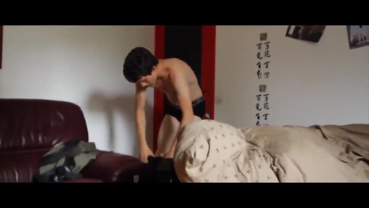 Opening cinematic shot establishing the urban parkour setting
The short opens with a clear visual language already in place. This isn’t accidental. Ramelli’s approach to short-form action content starts with knowing the emotional tone you’re after before the camera rolls. In this case, the target is that gritty, high-contrast action movie look – think European thriller, not American blockbuster. That distinction matters because it shapes every downstream decision: location scouting, time of day, how aggressive you go in post. If you can name the reference film or the mood in one sentence before you start, your on-set decisions get faster and your edit gets tighter.
Opening cinematic shot establishing the urban parkour setting
The short opens with a clear visual language already in place. This isn’t accidental. Ramelli’s approach to short-form action content starts with knowing the emotional tone you’re after before the camera rolls. In this case, the target is that gritty, high-contrast action movie look – think European thriller, not American blockbuster. That distinction matters because it shapes every downstream decision: location scouting, time of day, how aggressive you go in post. If you can name the reference film or the mood in one sentence before you start, your on-set decisions get faster and your edit gets tighter.
Step 2: Use the Location as a Visual Character
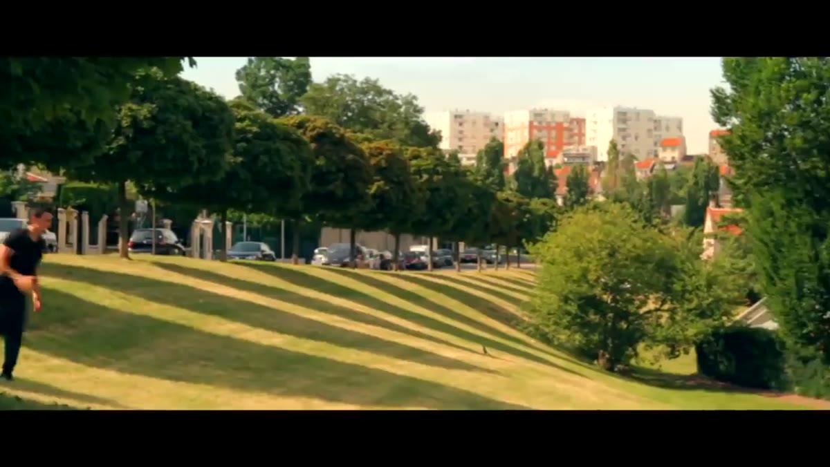 Wide establishing shot of urban environment with subject in motion
One of the first things Ramelli does is let the environment carry weight. The architecture, the light bouncing off concrete and stone, the depth of the urban landscape – these aren’t backdrops, they’re part of the story. For photographers moving into motion work, this is the adjustment that takes the longest to internalize. You’re not looking for a clean background. You’re looking for a space that has texture, history, and contrast. When scouting for this kind of project, Ramelli appears to be thinking in terms of movement paths as much as aesthetics – where can the subject travel through the frame in a way that uses the geometry of the space?
Wide establishing shot of urban environment with subject in motion
One of the first things Ramelli does is let the environment carry weight. The architecture, the light bouncing off concrete and stone, the depth of the urban landscape – these aren’t backdrops, they’re part of the story. For photographers moving into motion work, this is the adjustment that takes the longest to internalize. You’re not looking for a clean background. You’re looking for a space that has texture, history, and contrast. When scouting for this kind of project, Ramelli appears to be thinking in terms of movement paths as much as aesthetics – where can the subject travel through the frame in a way that uses the geometry of the space?
Step 3: Capture Coverage That Gives You Edit Options
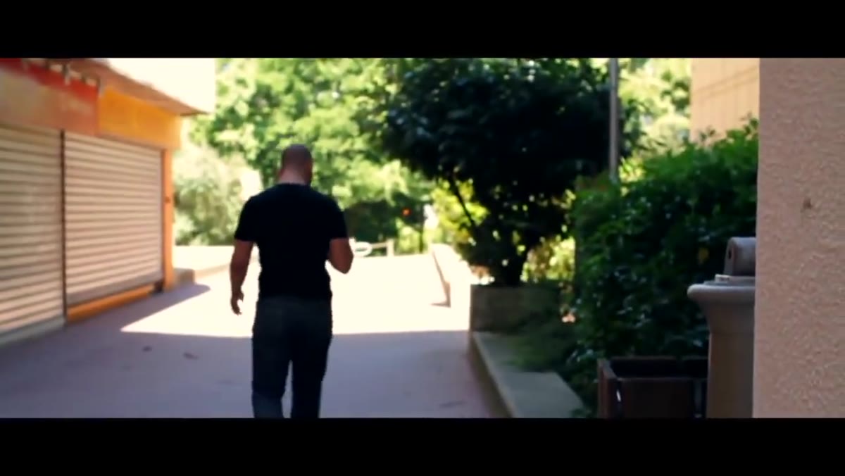 Multiple angles of parkour movement captured in sequence
The middle section of the shoot shows a deliberate approach to coverage. Ramelli isn’t just getting the hero shot. He’s building a library of angles, distances, and movement directions that will give him flexibility in the edit. For anyone doing fast editorial or commercial work, this is pure discipline. I learned this the hard way doing a campaign for a sporting goods client years ago – we had stunning hero frames and almost nothing to cut between them. The edit felt like a slideshow. The fix isn’t more dramatic shots, it’s more connective tissue: wider establishing moments, tighter detail clips, transitional movement. Ramelli’s coverage approach accounts for all of this.
Multiple angles of parkour movement captured in sequence
The middle section of the shoot shows a deliberate approach to coverage. Ramelli isn’t just getting the hero shot. He’s building a library of angles, distances, and movement directions that will give him flexibility in the edit. For anyone doing fast editorial or commercial work, this is pure discipline. I learned this the hard way doing a campaign for a sporting goods client years ago – we had stunning hero frames and almost nothing to cut between them. The edit felt like a slideshow. The fix isn’t more dramatic shots, it’s more connective tissue: wider establishing moments, tighter detail clips, transitional movement. Ramelli’s coverage approach accounts for all of this.
Step 4: Work With Available Light Aggressively
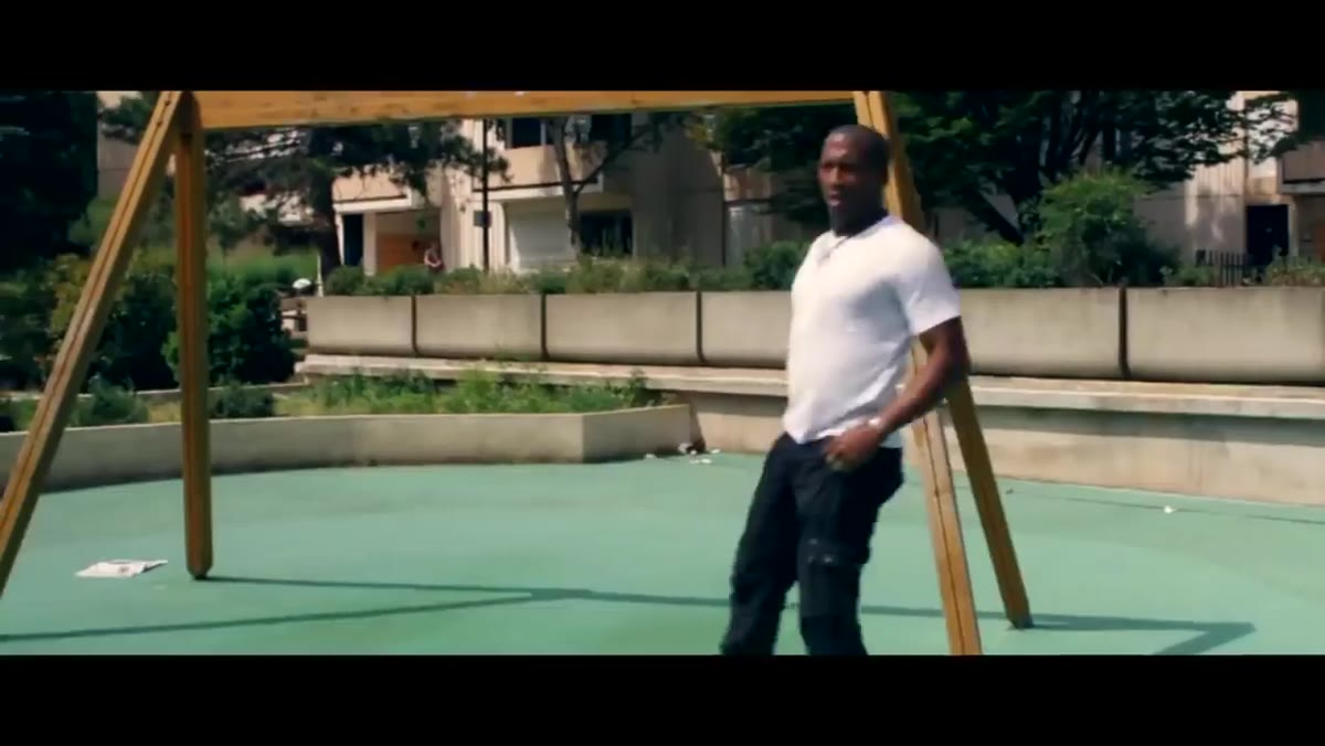 Subject moving through high-contrast natural lighting conditions
The lighting throughout the short is almost entirely natural, and Ramelli leans into the harshness rather than fighting it. Hard shadows, strong directional sun, blown-out highlights in the background – these are usually things photographers try to correct. Here they become part of the aesthetic. The key mindset shift is treating high-contrast natural light as a stylistic choice rather than a technical problem. This only works if your post-processing approach is calibrated to match. You’re not trying to recover those highlights later. You’re building an edit style that treats them as intentional texture.
Subject moving through high-contrast natural lighting conditions
The lighting throughout the short is almost entirely natural, and Ramelli leans into the harshness rather than fighting it. Hard shadows, strong directional sun, blown-out highlights in the background – these are usually things photographers try to correct. Here they become part of the aesthetic. The key mindset shift is treating high-contrast natural light as a stylistic choice rather than a technical problem. This only works if your post-processing approach is calibrated to match. You’re not trying to recover those highlights later. You’re building an edit style that treats them as intentional texture.
Step 5: Direct Performance, Not Just Movement
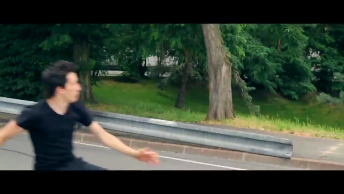 Director and subject interaction between takes on location
There’s a moment in the video where Ramelli is clearly working with his subject on something beyond the physical stunt – the attitude, the presence, the way Arthur carries himself between movements. This is the piece that separates a parkour clip from a short film. The technical execution of a jump or vault can be impressive on its own, but what makes it cinematic is what the subject communicates before and after the movement. Even in still commercial work, I’ve noticed that the frames that sell are rarely the peak-action frames. They’re the split second before or after, when the subject’s intention is readable. Directing for that moment is a learnable skill.
Director and subject interaction between takes on location
There’s a moment in the video where Ramelli is clearly working with his subject on something beyond the physical stunt – the attitude, the presence, the way Arthur carries himself between movements. This is the piece that separates a parkour clip from a short film. The technical execution of a jump or vault can be impressive on its own, but what makes it cinematic is what the subject communicates before and after the movement. Even in still commercial work, I’ve noticed that the frames that sell are rarely the peak-action frames. They’re the split second before or after, when the subject’s intention is readable. Directing for that moment is a learnable skill.
Step 6: Build a Consistent Color Grade That Serves the Tone
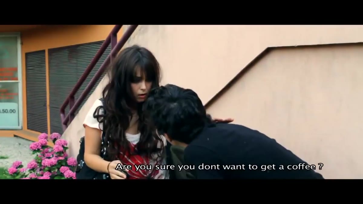 Edited sequence showing color grading and cinematic tone
The final cut has a unified look – desaturated midtones, pushed contrast, a slight coolness in the shadows. This isn’t a complex grade but it’s applied consistently, which is what makes the edit feel coherent rather than assembled. For photographers adapting this to Photoshop or Lightroom work, the lesson is that a restrained grade applied uniformly beats an aggressive grade applied inconsistently. Ramelli’s color approach here would translate cleanly into a Photoshop action: set your contrast curve, pull a specific hue out of the midtones, cool the shadows by a fixed amount, save it, batch it. The edit style becomes repeatable across a whole project.
Edited sequence showing color grading and cinematic tone
The final cut has a unified look – desaturated midtones, pushed contrast, a slight coolness in the shadows. This isn’t a complex grade but it’s applied consistently, which is what makes the edit feel coherent rather than assembled. For photographers adapting this to Photoshop or Lightroom work, the lesson is that a restrained grade applied uniformly beats an aggressive grade applied inconsistently. Ramelli’s color approach here would translate cleanly into a Photoshop action: set your contrast curve, pull a specific hue out of the midtones, cool the shadows by a fixed amount, save it, batch it. The edit style becomes repeatable across a whole project.
What I’d Add From My Own Workflow
The one thing I’d layer on top of Ramelli’s approach is a pre-shoot edit reference. Before any action-heavy shoot, I put together a one-page mood board that includes two or three color graded reference frames – not for inspiration, but as a calibration target. When I’m on location and the light shifts, I need to know whether that shift works for the grade I’ve already planned or whether I need to adjust my position. It keeps my coverage decisions grounded in the final look rather than just the available light. On longer commercial projects, this single habit has saved me hours of back-and-forth in post, because the client and I are aligned on tone before a single shot is taken.
Ramelli’s “Arthur” short is worth studying not because it’s technically complicated – it isn’t – but because it shows how clean creative discipline produces results that look expensive and intentional. The location, the light, the coverage, the grade: each one is a deliberate choice that compounds with the others. That’s the real workflow lesson here.
Comments (4)
Do you have any tips for applying this to landscape work?
Mostly agree, though I've had better results doing step 2 before step 1.
This finally clicked for me after struggling for months. Thanks.
Tested this with a few of my older photos and I'm genuinely impressed.
Leave a Comment