Texture overlays are one of those techniques I resisted for years because I assumed they were a shortcut for photographers who didn’t know what they were doing. After about a decade and a half of commercial work, I’ll admit I was wrong. Done well, textures add atmospheric depth that’s nearly impossible to fake with adjustments alone, and they do it fast. For high-volume retouching work, that speed matters more than most tutorials acknowledge.
In this PHLEARN tutorial, Watch the full tutorial on YouTube, the whole process runs under two minutes, which is either a sign of how simple it is or how much gets left unsaid. Probably both. What I want to do here is slow it down and give you the context that a two-minute format can’t afford, including why certain blend modes behave the way they do and where these techniques fit into a real editing session.
The tutorial covers three distinct texture types: a color texture, a dust-and-scratches overlay, and a lighting effects texture. Each uses a different blend mode strategy, and understanding those differences will make you more confident adapting this to your own images rather than just copying the steps.
Step 1: Source Your Textures
 Free stock texture websites shown as texture sources
Before you open Photoshop, you need actual texture files to work with. Free stock image sites are a solid starting point, and PHLEARN also offers downloadable texture packs directly on their site. What you’re looking for are high-resolution files, ideally matching or exceeding the pixel dimensions of your working image. A texture that’s too small will look soft or pixelated once you scale it up to cover your photo. I keep a dedicated folder of about 40 or 50 textures organized by type: grunge, paper, light leak, fabric. Color-coded folders, naturally.
Free stock texture websites shown as texture sources
Before you open Photoshop, you need actual texture files to work with. Free stock image sites are a solid starting point, and PHLEARN also offers downloadable texture packs directly on their site. What you’re looking for are high-resolution files, ideally matching or exceeding the pixel dimensions of your working image. A texture that’s too small will look soft or pixelated once you scale it up to cover your photo. I keep a dedicated folder of about 40 or 50 textures organized by type: grunge, paper, light leak, fabric. Color-coded folders, naturally.
Step 2: Place and Scale the Color Texture
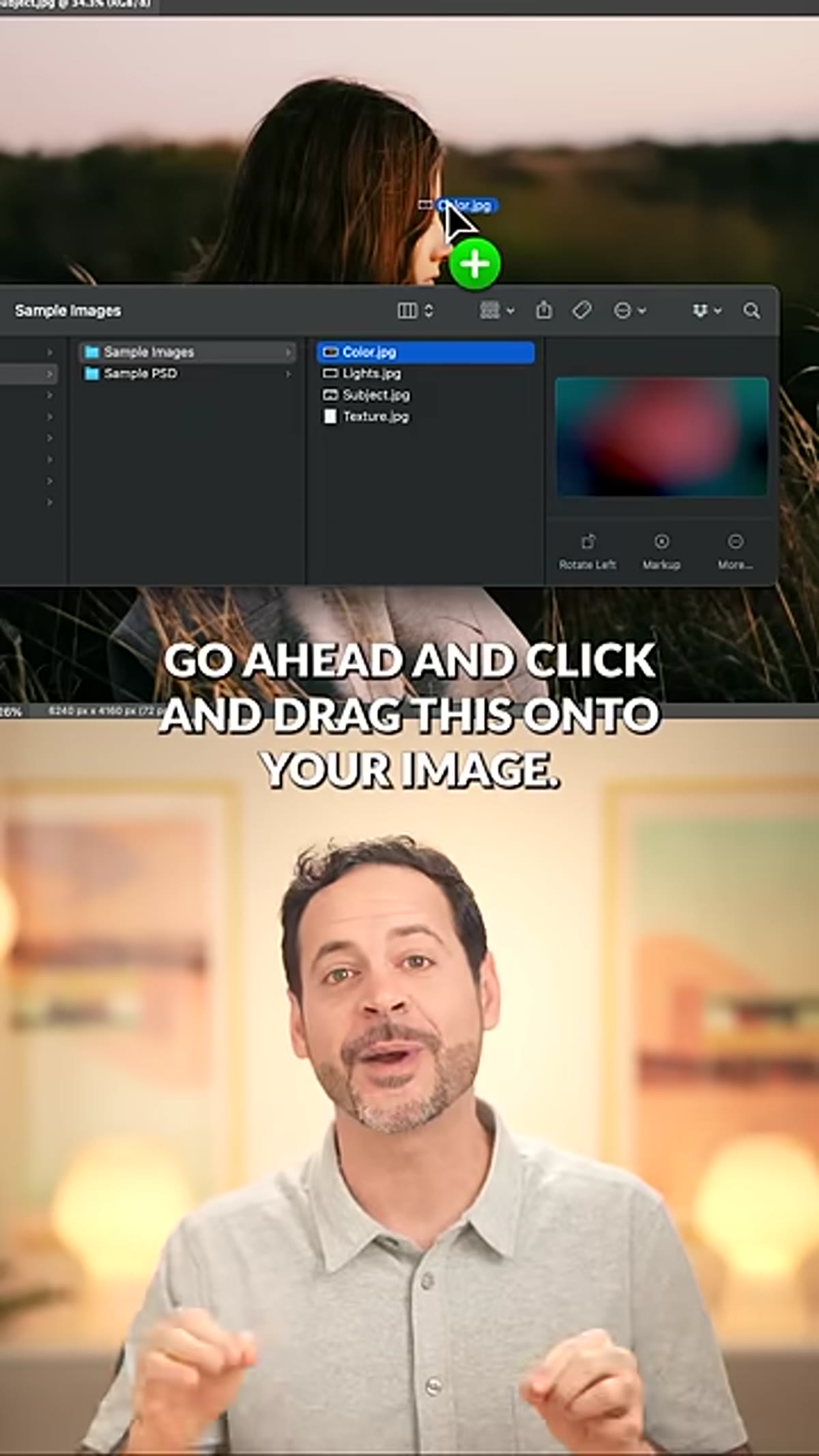 Color texture being dragged onto the image in Photoshop
Open your base image in Photoshop, then click and drag your color texture file directly onto the canvas. Photoshop will place it as a Smart Object, which is useful because it lets you scale and reposition non-destructively. Pull the transform handles out until the texture covers your entire photograph with no gaps at the edges, then commit the transform by pressing Enter or Return.
Color texture being dragged onto the image in Photoshop
Open your base image in Photoshop, then click and drag your color texture file directly onto the canvas. Photoshop will place it as a Smart Object, which is useful because it lets you scale and reposition non-destructively. Pull the transform handles out until the texture covers your entire photograph with no gaps at the edges, then commit the transform by pressing Enter or Return.
The goal here is full coverage. Any exposed edge of your original image underneath the texture will look like a mistake rather than a stylistic choice.
Step 3: Set the Blend Mode to Lighten and Adjust Opacity
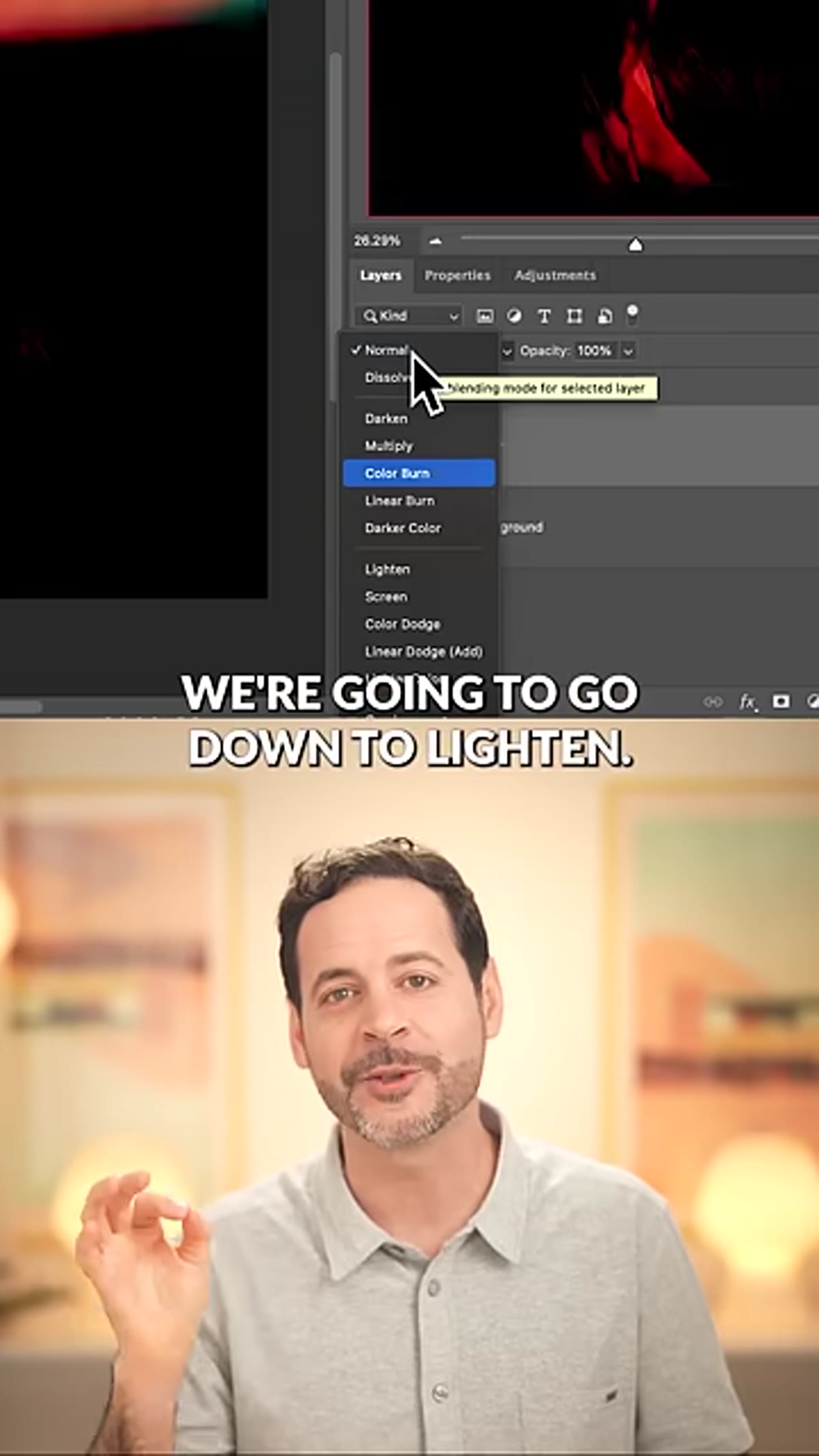 Blend mode dropdown open with Lighten mode selected
With the texture layer selected, open the blend mode dropdown in the Layers panel and switch from Normal to Lighten. In Lighten mode, Photoshop compares each pixel in the texture to the corresponding pixel in the layer below and displays whichever one is lighter. The practical effect is that the texture only visibly influences the darker areas of your image, which tends to feel organic rather than painted on.
Blend mode dropdown open with Lighten mode selected
With the texture layer selected, open the blend mode dropdown in the Layers panel and switch from Normal to Lighten. In Lighten mode, Photoshop compares each pixel in the texture to the corresponding pixel in the layer below and displays whichever one is lighter. The practical effect is that the texture only visibly influences the darker areas of your image, which tends to feel organic rather than painted on.
From there, reduce the layer opacity until the effect reads as subtle and integrated. There’s no universal number here. For most of my ad work I end up somewhere between 20 and 40 percent, but portraits with a lot of skin often need less, sometimes as low as 15. Let your eye guide you rather than chasing a specific value.
Step 4: Add the Dust and Scratches Texture Using Multiply (or Screen)
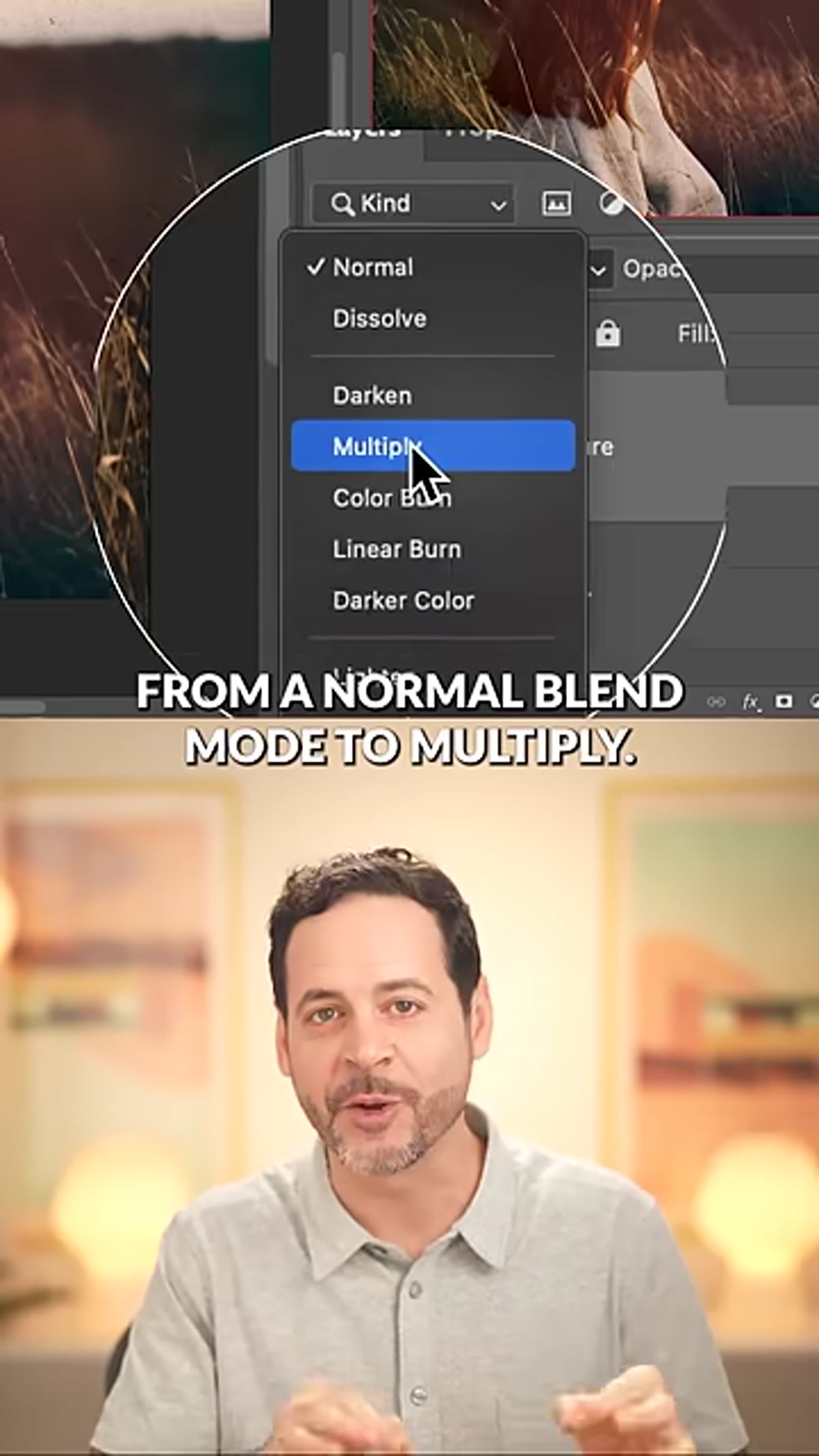 Dust and scratches texture layer with Multiply blend mode applied
Drag your dust-and-scratches texture onto the image the same way, scale it to cover everything, and this time set the blend mode to Multiply. Multiply darkens the image by multiplying the luminosity values of both layers together, which makes it ideal for adding grime, grain, or aged film effects that should visually sink into the image rather than float on top.
Dust and scratches texture layer with Multiply blend mode applied
Drag your dust-and-scratches texture onto the image the same way, scale it to cover everything, and this time set the blend mode to Multiply. Multiply darkens the image by multiplying the luminosity values of both layers together, which makes it ideal for adding grime, grain, or aged film effects that should visually sink into the image rather than float on top.
If you want the same texture to add a lightening effect instead of a darkening one, invert the texture first using Ctrl+I (Windows) or Command+I (Mac). Once inverted, switch the blend mode to Screen. Screen is essentially the opposite of Multiply, it brightens by calculating the inverse of the darkened result, so your texture will now lift midtones and highlights rather than pull them down. The invert-then-Screen combination is a technique I use constantly for adding light grain to darker images.
Step 5: Recolor the Texture with Hue/Saturation
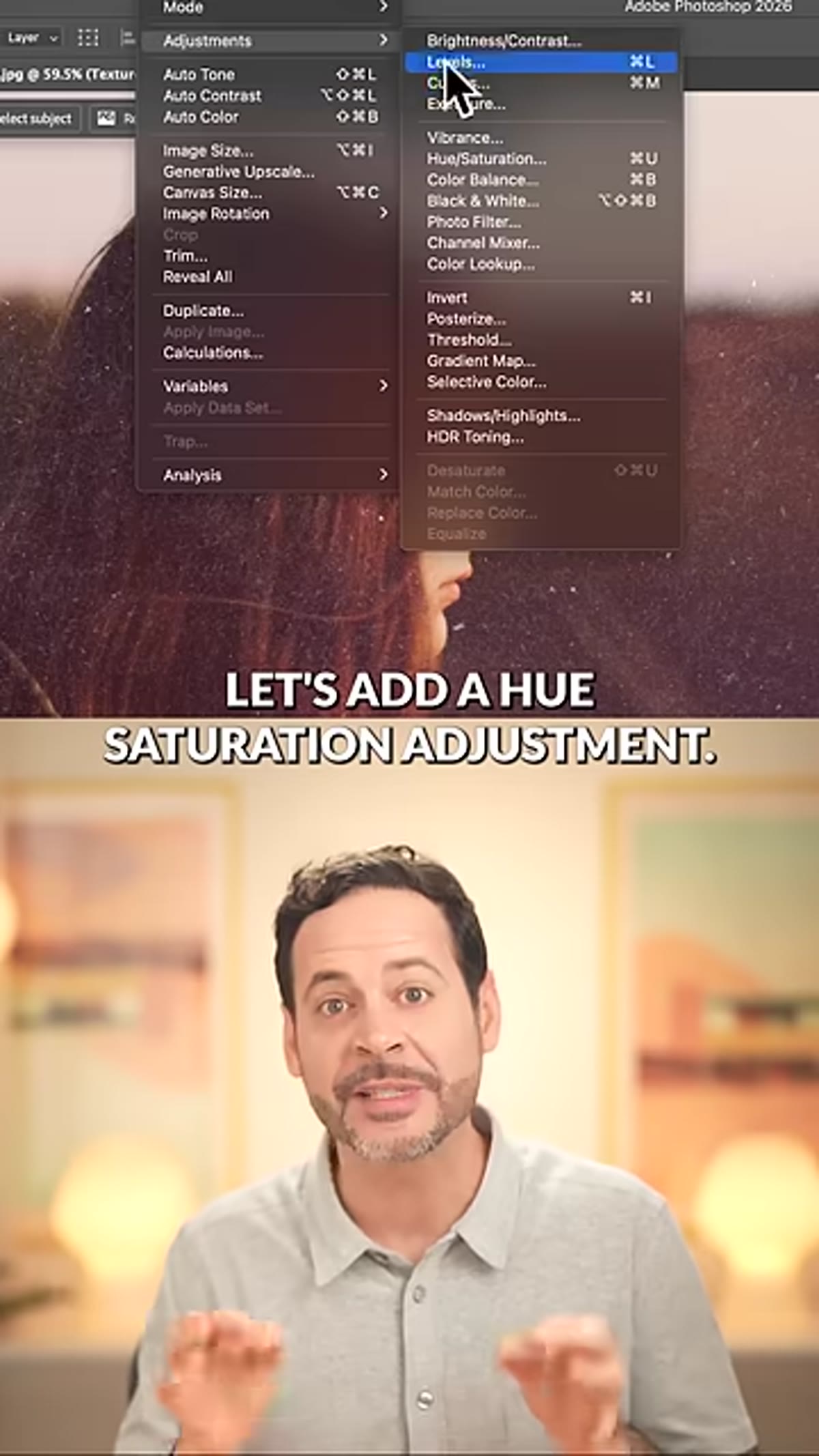 Hue Saturation adjustment panel with Colorize checkbox active
A grayscale dust texture applied in Multiply or Screen mode will carry whatever neutral tone it has into your image, which can fight against your color grade. To fix this, add a Hue/Saturation adjustment layer directly above the texture layer and clip it to that layer by holding Alt (Windows) or Option (Mac) and clicking between the two layers in the Layers panel.
Hue Saturation adjustment panel with Colorize checkbox active
A grayscale dust texture applied in Multiply or Screen mode will carry whatever neutral tone it has into your image, which can fight against your color grade. To fix this, add a Hue/Saturation adjustment layer directly above the texture layer and clip it to that layer by holding Alt (Windows) or Option (Mac) and clicking between the two layers in the Layers panel.
In the Hue/Saturation panel, check the Colorize box. This forces the entire texture to a single hue, and from there you can dial in the Hue and Saturation sliders until the texture color complements your image. For warm-toned portraits I usually push toward amber or sepia. For cooler, more editorial looks I’ll shift toward a desaturated blue-green. This small step is what separates a texture that looks like a stock effect from one that feels intentional.
Step 6: Apply the Lighting Texture with a Layer Mask
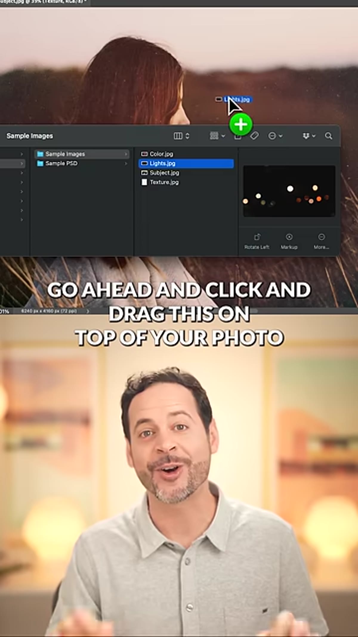 Lighting effects texture placed over photo with Screen blend mode
The third texture type in the tutorial is a lighting effects overlay, think lens flares, light bokeh, or soft glow elements. Place it on top, scale to cover the image, and set it to Screen mode. Screen is the natural choice for light-based textures because pure black in the texture becomes invisible, so only the light elements show through.
Lighting effects texture placed over photo with Screen blend mode
The third texture type in the tutorial is a lighting effects overlay, think lens flares, light bokeh, or soft glow elements. Place it on top, scale to cover the image, and set it to Screen mode. Screen is the natural choice for light-based textures because pure black in the texture becomes invisible, so only the light elements show through.
The important addition here is a layer mask. Once the texture is in place, add a mask to the layer, then use a soft black brush to paint away any part of the light effect that overlaps your subject’s face or the key focal area of the image. A stray bright bloom across someone’s eyes can ruin an otherwise polished composite. The mask gives you precise control without permanently altering anything.
What I’d Add From My Own Practice
The tutorial is tight and accurate, but it doesn’t mention grouping. Once I have two or three texture layers working together, I select them all and group them into a folder, then set the group opacity rather than adjusting each layer individually. This means I can dial the entire texture treatment up or down as a unit, which is invaluable when a client asks for a “slightly less grungy” version at the last minute. I also save that group as a layer comp so I can toggle between the textured and clean versions instantly without flattening anything.
If you’re processing more than a handful of images with the same texture treatment, it’s worth taking the extra ten minutes to record the layer placement and blend mode setup as a Photoshop Action. The opacity and mask painting will still need manual attention per image, but the mechanical steps can run automatically while you focus on the creative calls.
The single most useful thing this tutorial reinforces is that blend modes aren’t arbitrary. Lighten, Multiply, and Screen each have a logical reason for being the right tool in a specific situation, and once you understand the underlying logic you stop guessing and start making decisions. That shift is what moves texture work from a novelty into a reliable part of your editing toolkit.
Watch the full tutorial on YouTube to see all three techniques demonstrated in real time, and grab the free sample textures from PHLEARN’s site to follow along.
Comments (5)
Great breakdown. The step-by-step approach really helps.
Quality content like this is rare. Keep it up.
Just used this on a wedding shoot edit. Client was thrilled.
Would love to see a follow-up going deeper into this topic.
Really solid breakdown. This pairs perfectly with the photography work I've been writing about.
Leave a Comment